Proof of Concept | 2026

Data dashboards focus too much on putting ALL the data on the screen. What they should be focused on are the key insights users need to make better, more timely decisions. That means taking the time to understand your users and grounding design decisions in the psychology of perception.
Most of my recent design work is confidential, so I put together this proof of concept to illustrate...
Let’s say my client is a SaaS infrastructure company whose IT folks need to monitor network data and react to incidents in real time.
Without getting too into the statistical weeds, they want to track…
Your typical dashboard might shotgun pie graphs and gauges all over the screen, but that only increases the cognitive burden on users. They need to learn which data are most important to them, where to find it, and then hold it all in their working memory while they make decisions. The end results are slower decision making and higher error rates. We can do so much better.
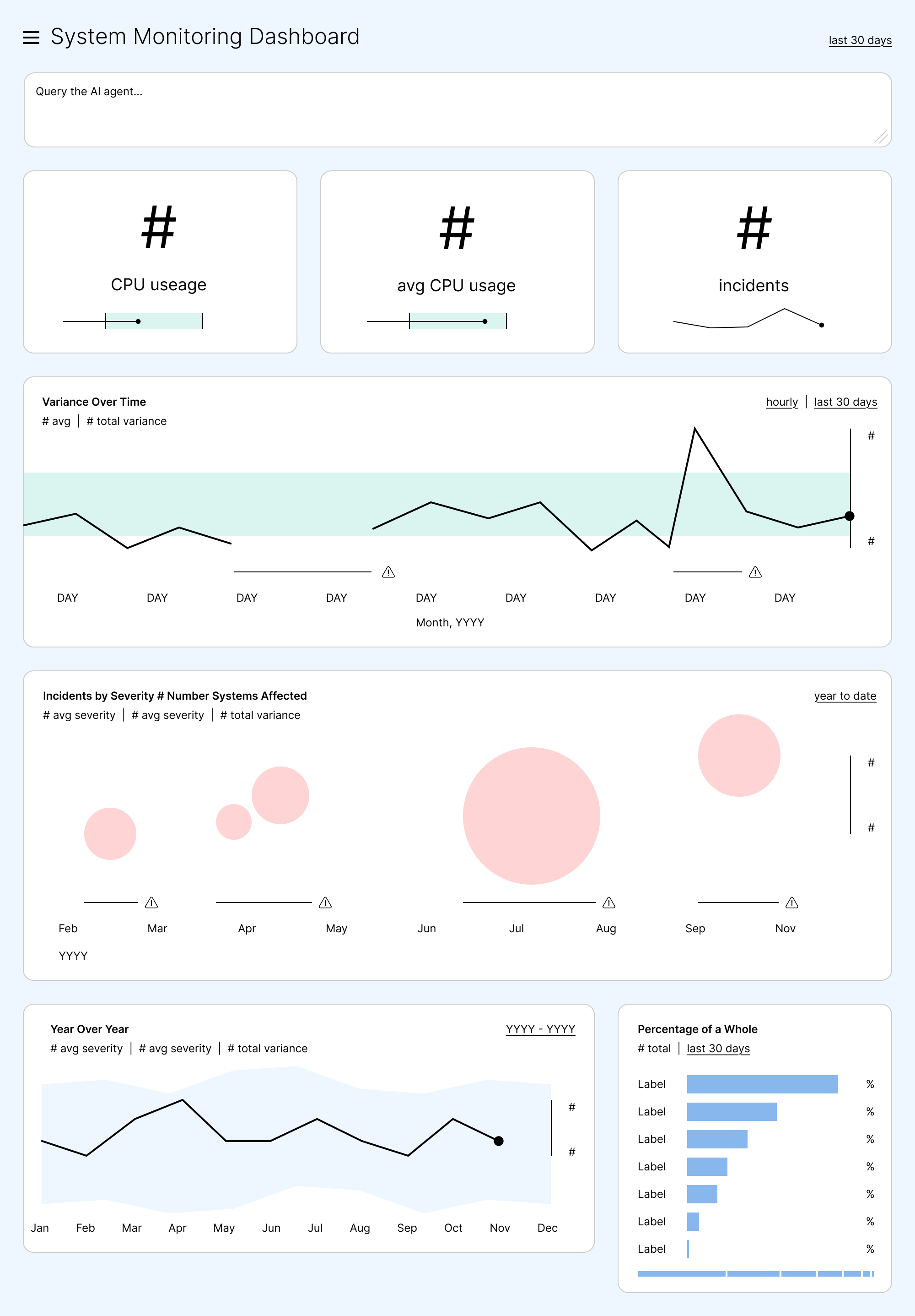
First and foremost, we want to identify those key insights. That means talking to users, but professionals can be a tricky bunch. They’ll talk all day about detailed requirements, but fail to tell you what they actually do with all this information. It takes a deft touch to draw them out.
For this example, let’s say the key insights are…
We’d also likely hear that IT professionals need to interrogate this data in a variety of ways, so an AI workspace right at the top might be useful.
Having figured out what users need, the next strategy will be to clear everything else off the dashboard. If it’s not carrying useful information, it goes. No static gridlines, no repetitive date labels, no legends professional users will only look at once. (We can display that kind of information when needed via on-click interactions.)
Minimalism is key. It provides the clarity needed to communicate insights at a glance.
The first and most important insight is real-time CPU usage, both a snapshot of the present and how it’s changed recently. Line graphs intuitively convey time, so that’s where we’ll start.
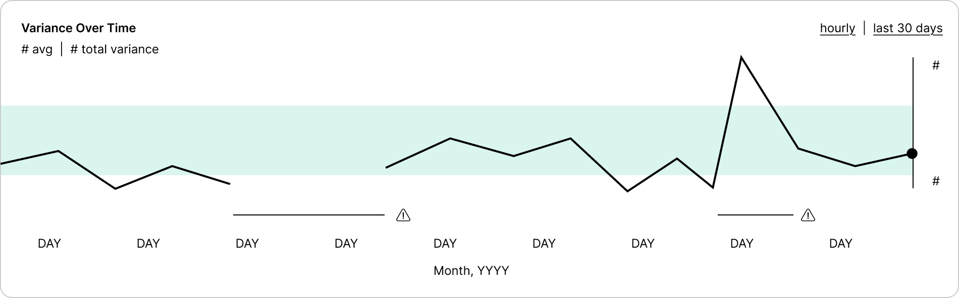
Here, CPU performance is displayed over a background fill that visualizes a normal range. The y-axis shows the highest and lowest values in the set, i.e. the total variance. This communicates the first key insight at a glance, no noisy gridlines needed.
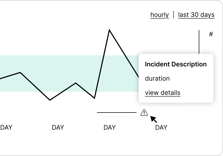
A pencil line along the x-axis allows us to call out periods where there was a known incident, providing context. The month and year appear only once, on the first of the month, to further declutter the UI. (This is especially important on a dashboard, where multiple graphs will appear together. Clutter stacks quickly.)

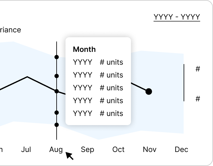
Actual values can be displayed when the user clicks on a line or a moment. This is called progressive disclosure and it’s a foundational UX technique for reducing cognitive load. Users tell you what part of the data set they’re interested in by clicking, then the UI displays all relevant data in one place.
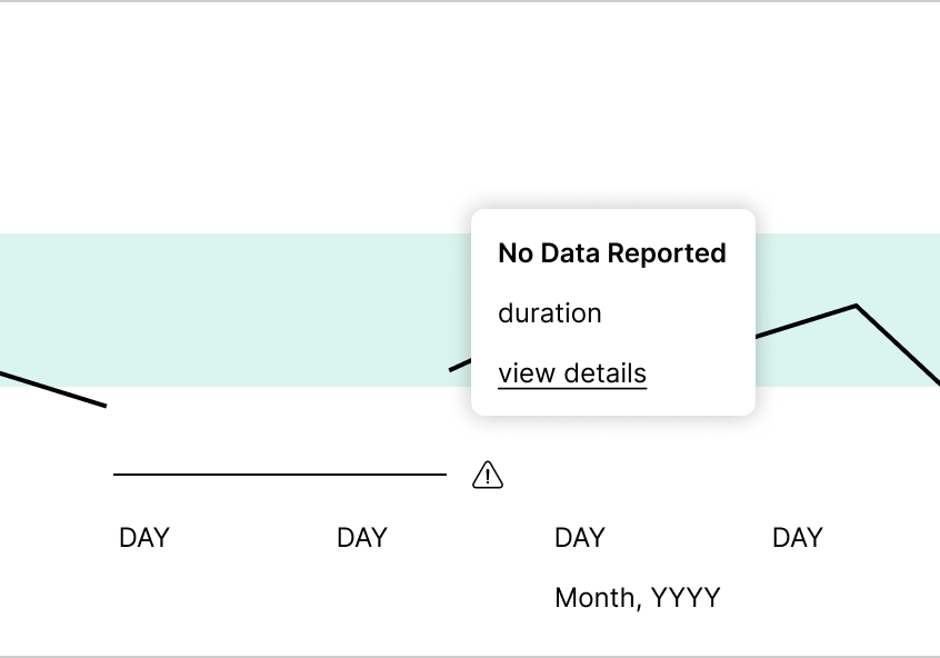
Finally, gaps in the data are intuitively represented by gaps in the graph, allowing users to immediately tell the difference between extremely low CPU usage (a performance issue) and missing data (a reporting issue).
So far, so good, but what happens when there are multiple lines?
The usual approach is to overlay multiple lines on the same graph, then aggressively color code them. This also increases cognitive load, because users must constantly glance back and forth from the graph to the key. When there are more than a few lines, high-contrast color coding can also be an assault on the eyes. I don’t recommend it.
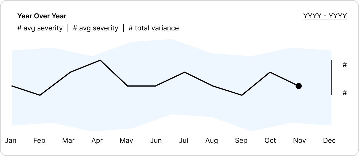
Instead, we’ll keep the focus on one line at a time and use the rest of the data to drive a key insight: How is CPU usage trending over time? Here, all past years are “blended” into a background fill that visualizes the total range of values. The user can easily see if the current year is running high or low within that range.
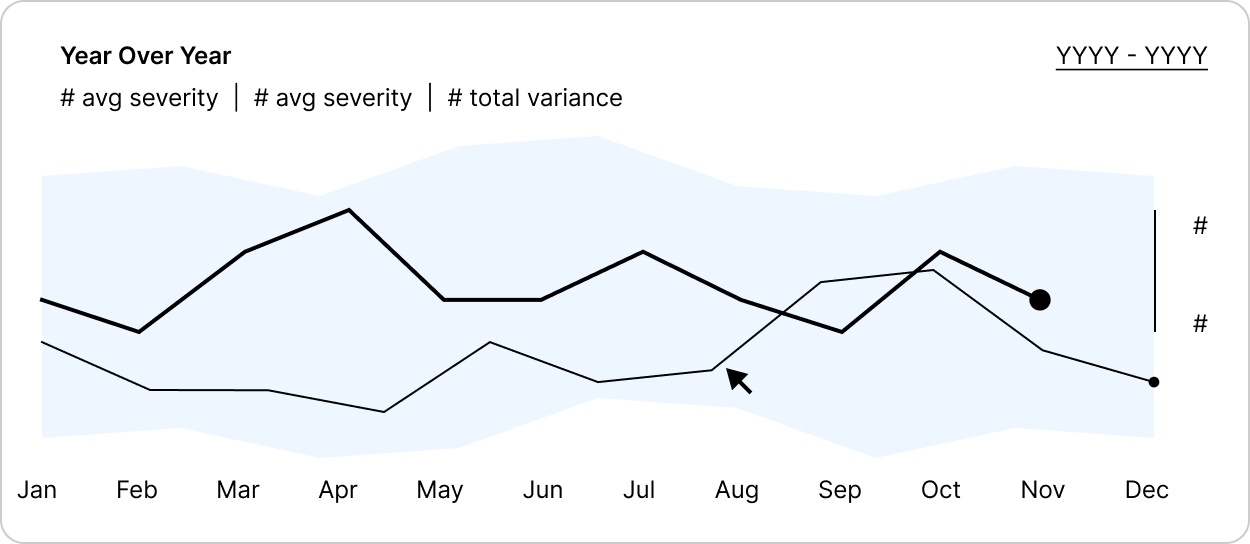
Users could select a new year from the filter at top right, but they could also move their mouse over the graph to reveal past years on hover. Clicking a month would reveal data points for all years.
These techniques make it easy to communicate changes in a single data set over time, but some insights come from comparing multiple dimensions of data. Layering more than two into a single graph means going beyond overlapping lines.
For this example, let’s say users want to track incidents by both their severity and the number of systems affected. Just as lines intuitively communicate time, area communicates size, so we’ll start with a bubble graph.
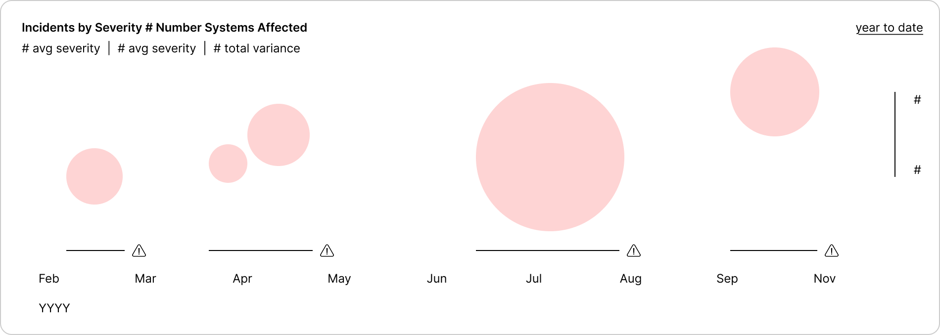
Here, the area of each bubble visualizes the number of systems affected, so the eye can easily balance size and severity. Position indicates time, just as in the line graphs, with known issues called out on the x-axis.
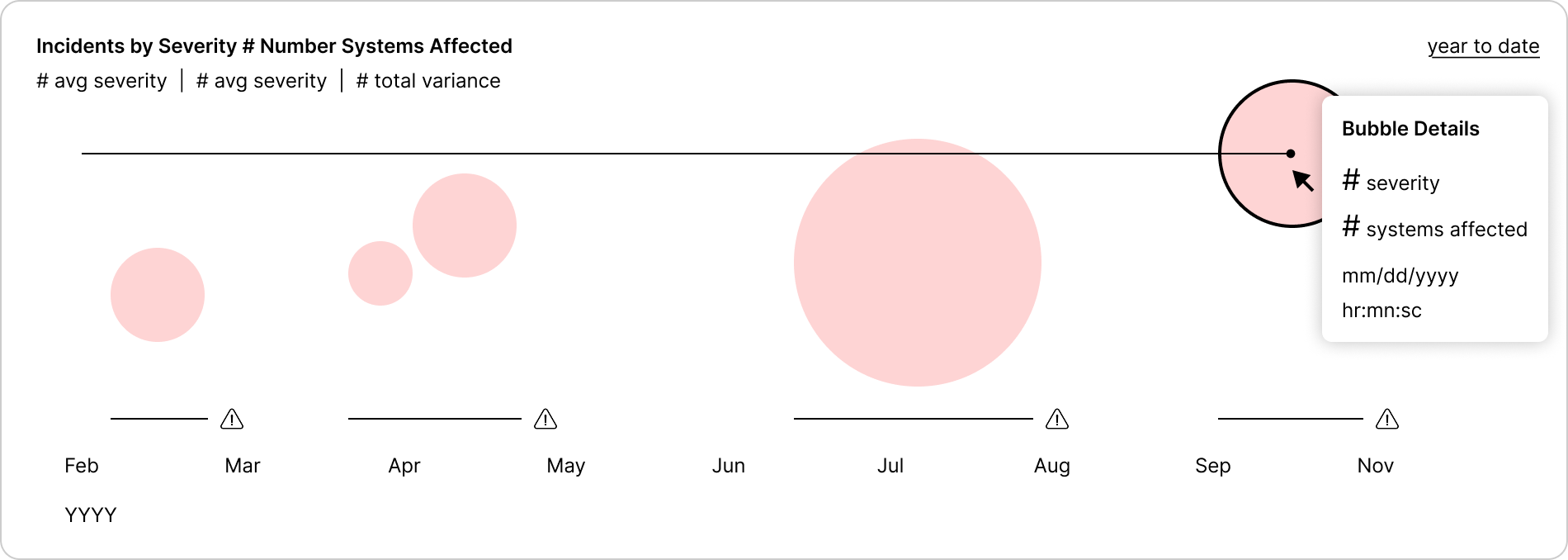
Clicking on a bubble reveals its actual values and overlays a reference line, so the bubble shapes don’t obscure relative position on the y-axis. A bonus feature of this setup is that size visually increases severity. This is apt, because a mild issue that affects many systems might be higher priority than a moderate issue affecting only a few.
Next, we’ll move away from visualizing time and focus on the present…
For real-time monitoring, I also want to highlight a few key metrics right at the top of the dashboard. However, raw numbers often lack context that users need to make quick value judgments. (“Is this number good or bad? High or low? Going up or down?”)
Micrographs supplement raw numbers by adding that context in space-efficient, immediately glanceable formats. Here, I’ve used sparklines and a modified bullet graph.
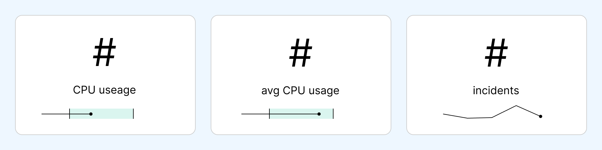
Sparklines are tiny line graphs without any axis labels. They’re great at communicating trend (up, down, or steady).
Bullet graphs position values within a range, either normal variance or some target range (high, low, or normal).
As always, it’s important to pick the best micrograph for each metric. Stacking multiples only clutters the interface and increases cognitive load. Reducing cognitive load is always the name of the game.
Designing a good dashboard requires more than an eye for design. It starts with understanding your users and the key insights that drive their decision making. Designers need a solid grasp of the psychology of perception, so they can select visual metaphors that intuitively communicate insights.
It’s harder than it looks, but I love it.
Next: Data Visualization...
Proof of Concept | 2026
Sunrun | 2019-2021
Wells Fargo | 2017-2018
Symphony Commerce | 2015-2016
Best Buy | 2014
General Mills | 2010-2013
Share Your Style | 2014
Walker Art Center | 2016